
BRANDING
Laboratoires Garnier
SPRING 2026
A speculative rebrand of Garnier Fructis, reviving the brand's founding name and a lab-themed packaging system.
GARNIER LOGO HISTORY
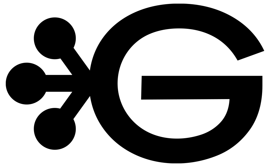
When Garnier launched, it began with the name ‘Laboratoires Garnier.’ I brought that name back to anchor the identity in the brand's history and emphasize the organic quality.
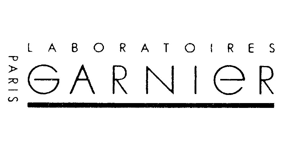
1904 Logo
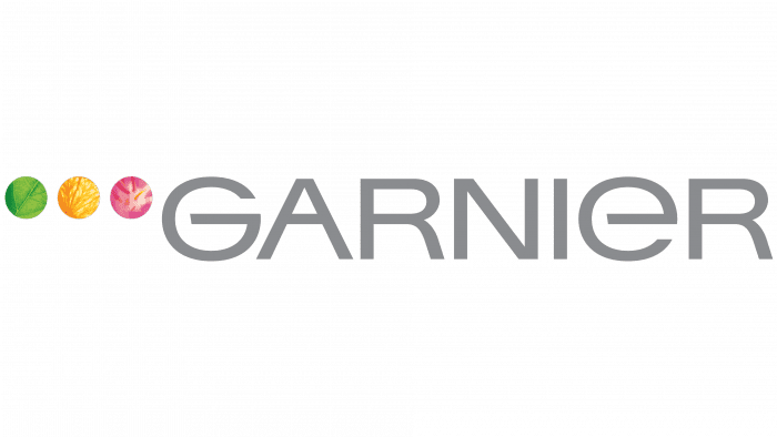
2002 Logo
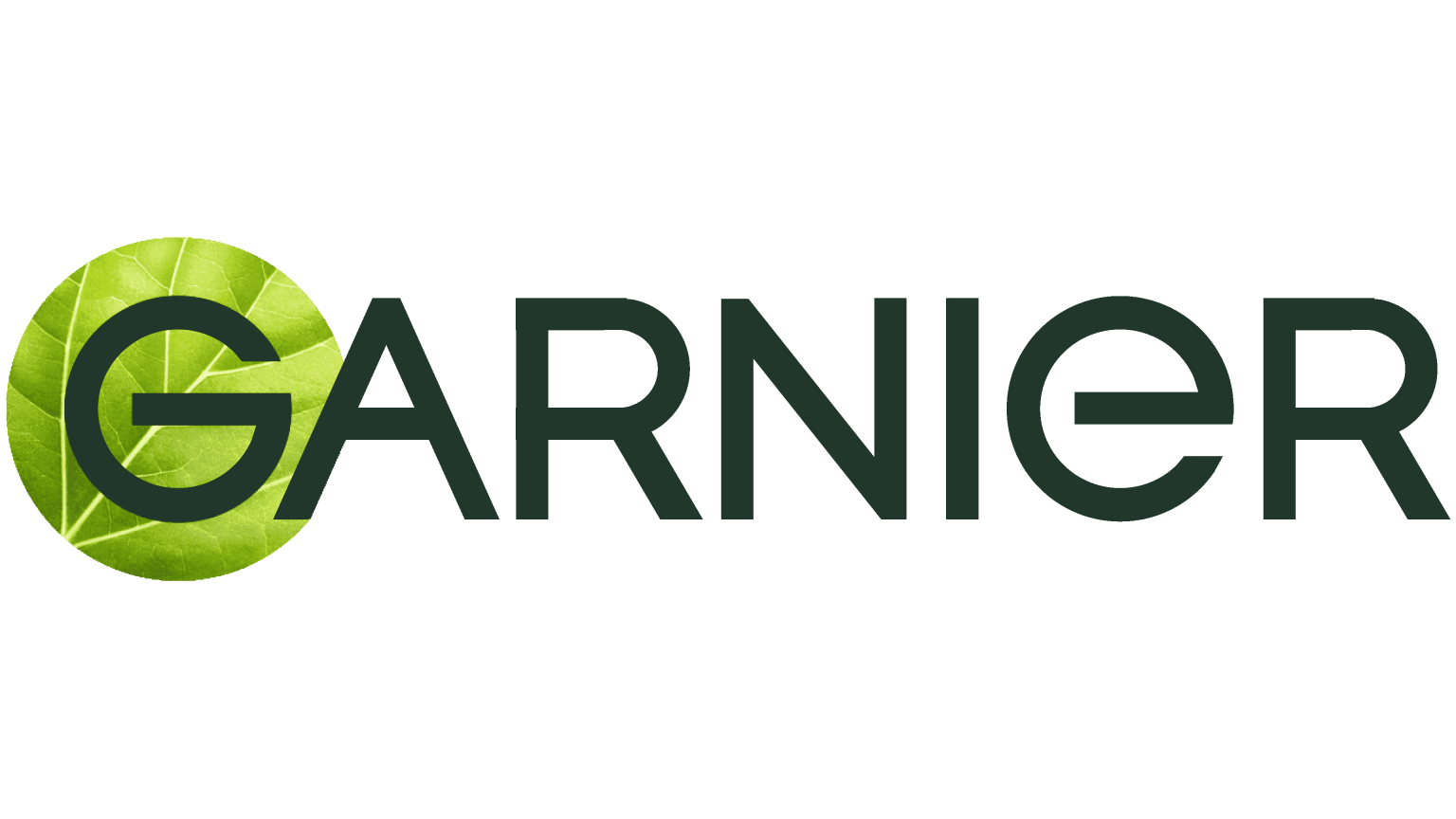
Current Logo
PROCESS
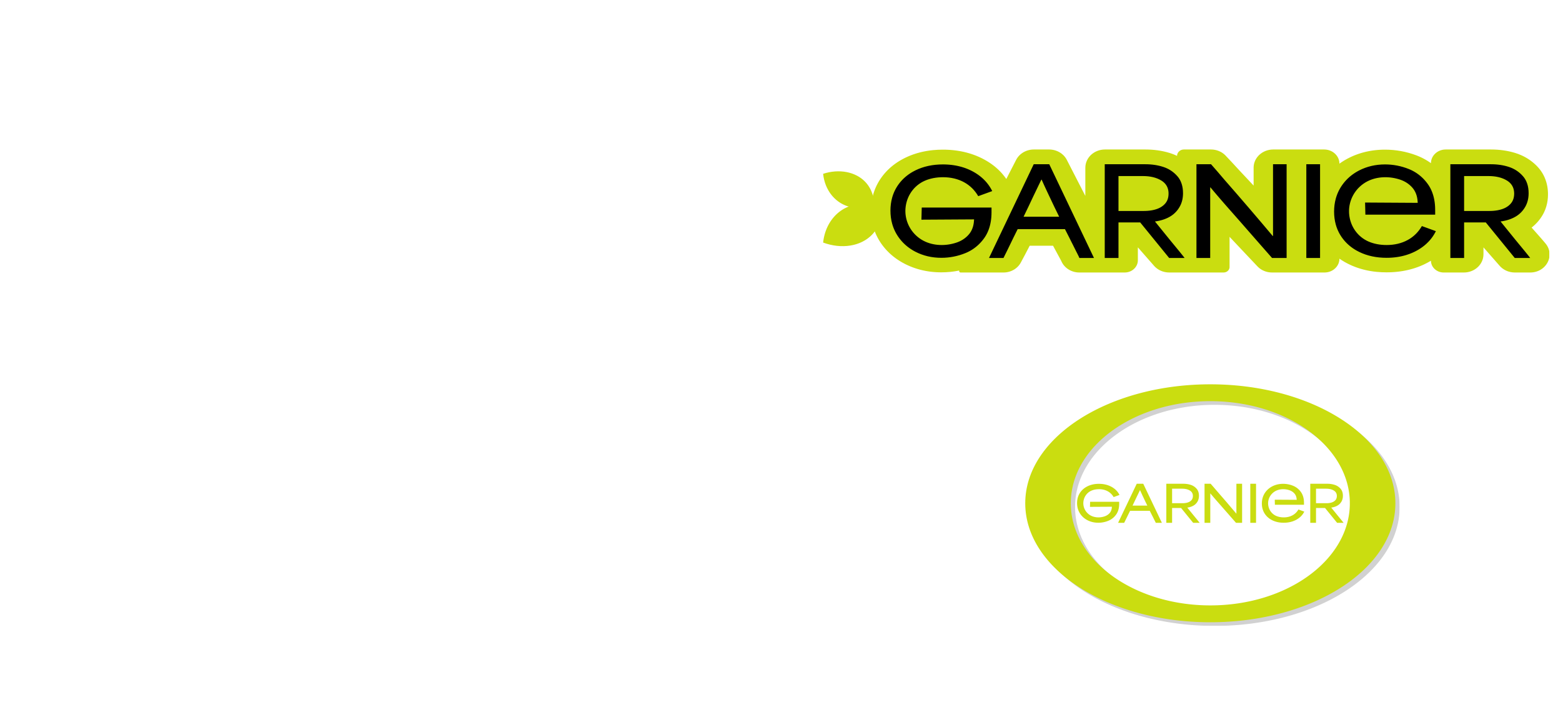
The three dots from the 2002 logo inspired the new mark, guiding the first iterations which explored dots as bubbles and a leaf frame.

FINALIZED SYSTEM
For the finalized version of the logo, I bent the dots into a jointed, branching shape to read as a molecular bond, reinforcing the ‘laboratoires’ story. The lowercase ‘a’ in ‘Garnier’ was kept soft and organic to balance the more clinical bond icon. The molecular bond motif ties the wordmark, ingredient callouts, and packaging pattern into one recurring shape. The typography and a molecular bond mark carry the ‘lab’ half, and the vibrant green palette and oil-drop imagery in the packaging system carry the ‘nature’ half.
PACKAGING MOCKUPS
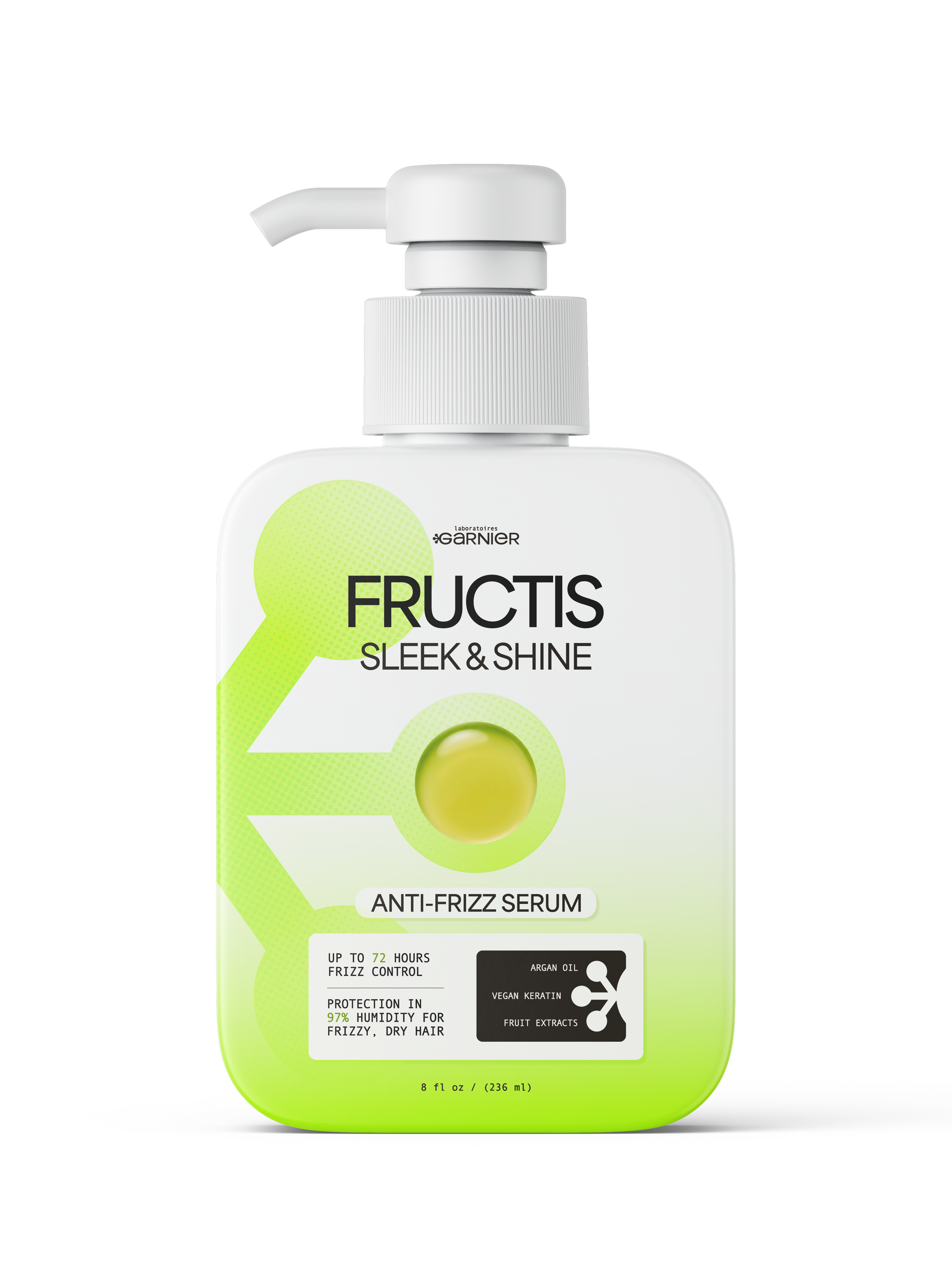
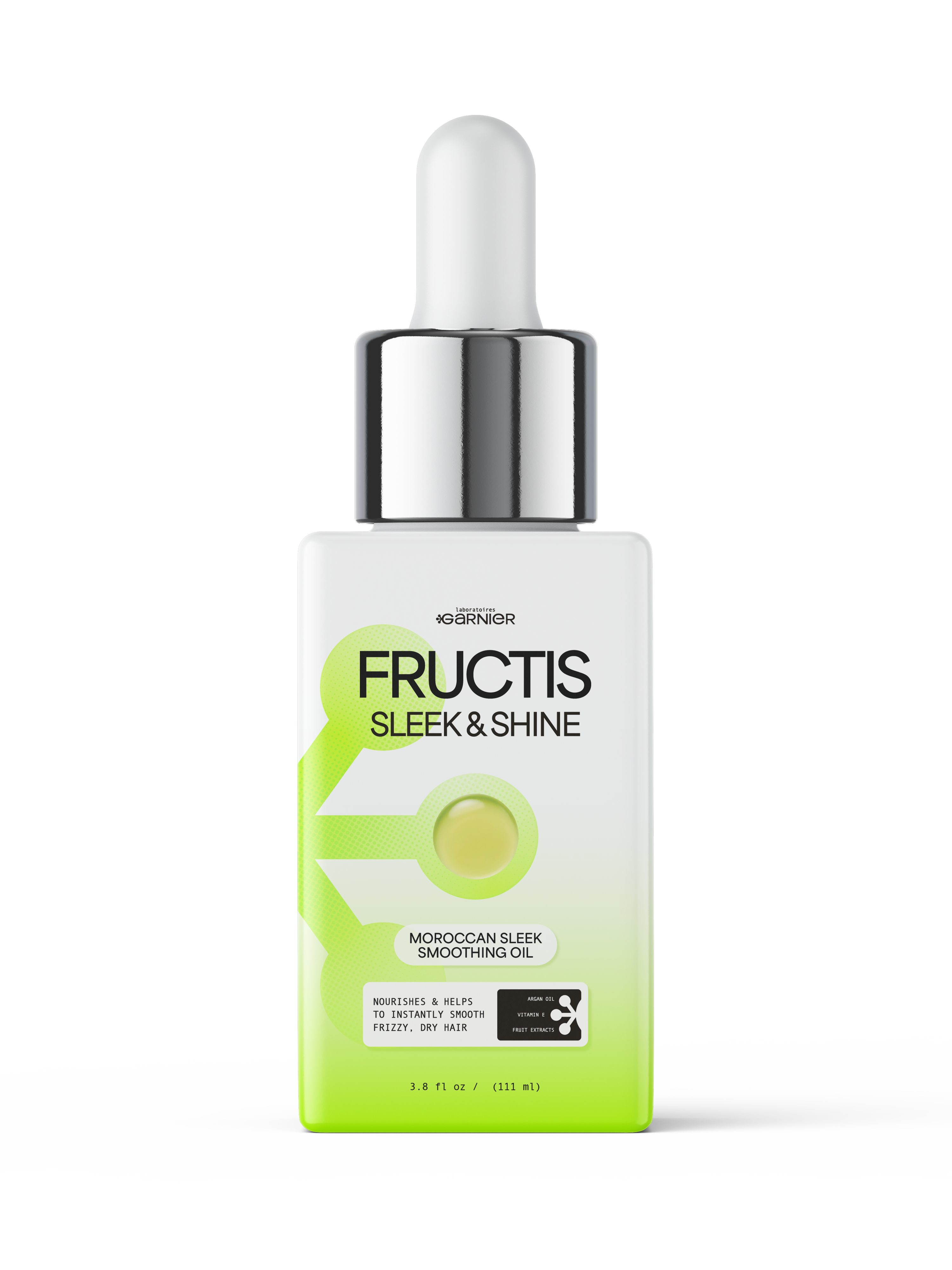
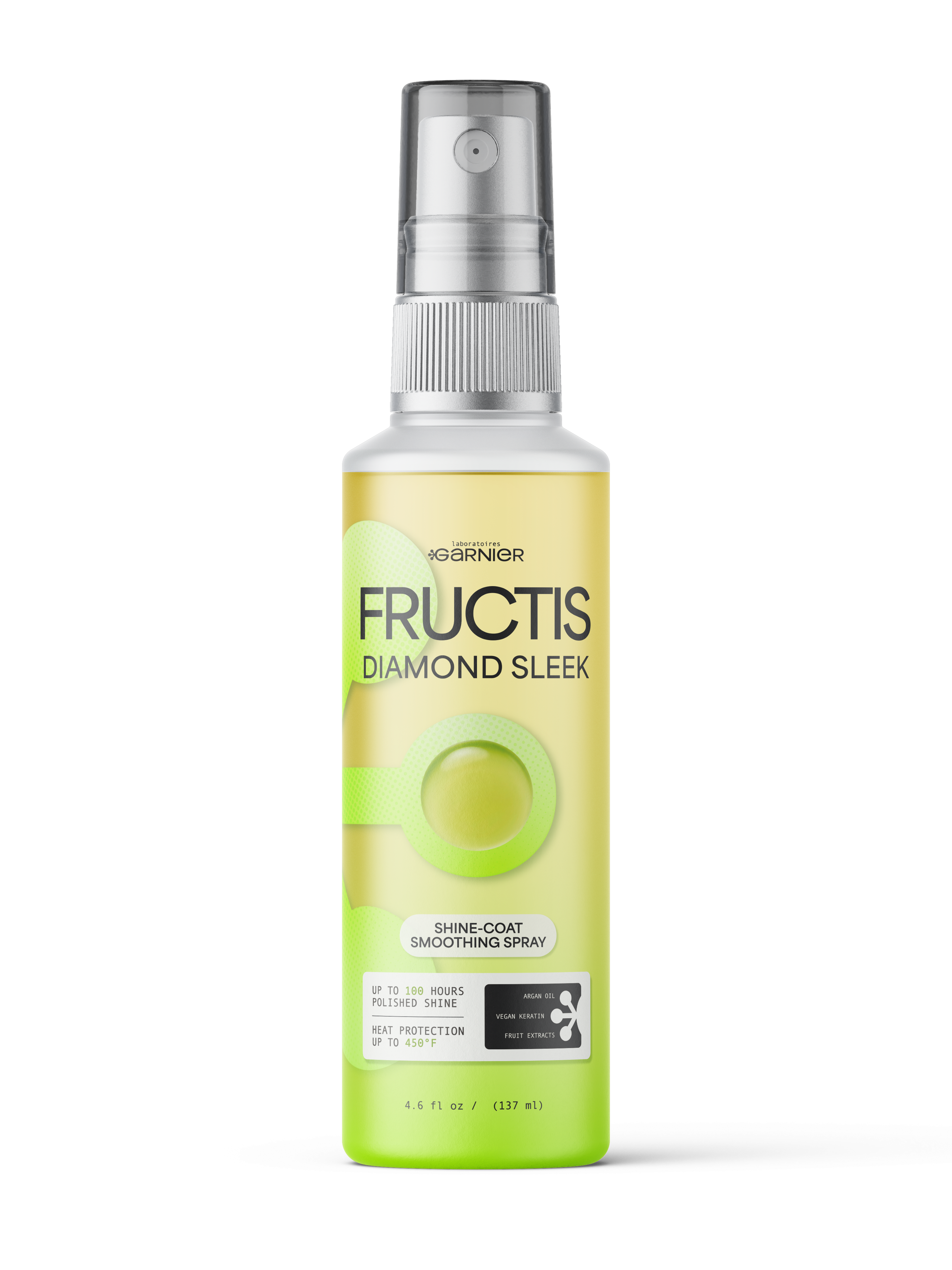
With this new logo, I created a three piece system for pump, spray, and dropper bottles. They are unified by the green gradient, oil-drop hero shot, and molecular ingredient icon. The molecular-bond mark reappears in the ingredient callout box, labeling argan oil, vegan keratin, and fruit extracts.
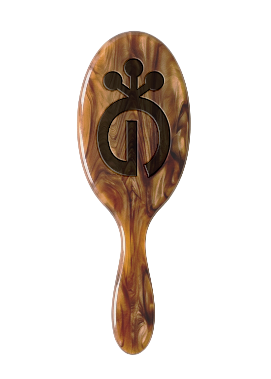
HAIRBRUSH MOCKUP
The wordmark was built to work as a standalone icon, so it carries onto merch like this marbled paddle brush without needing the full wordmark for support.
BRANDING
Laboratoires Garnier
SPRING 2026
A speculative rebrand of Garnier Fructis, reviving the brand's founding name and a lab-themed packaging system.
When Garnier launched, it began with the name ‘Laboratoires Garnier.’ I brought that name back to anchor the identity in the brand's history and emphasize the organic quality.
GARNIER LOGO HISTORY
PROCESS
Finalized system
For the finalized version of the logo, I bent the dots into a jointed, branching shape to read as a molecular bond, reinforcing the ‘laboratoires’ story. The lowercase ‘a’ in ‘Garnier’ was kept soft and organic to balance the more clinical bond icon. The molecular bond motif ties the wordmark, ingredient callouts, and packaging pattern into one recurring shape. The typography and a molecular bond mark carry the ‘lab’ half, and the vibrant green palette and oil-drop imagery in the packaging system carry the ‘nature’ half.
2002 Logo
Current Logo
1904 Logo
The three dots from the 2002 logo inspired the new mark, guiding the first iterations which explored dots as bubbles and a leaf frame.
Hairbrush MOCKUP
The wordmark was built to work as a standalone icon, so it carries onto merch like this marbled paddle brush without needing the full wordmark for support.
With this new logo, I created a three piece system for pump, spray, and dropper bottles. They are unified by the green gradient, oil-drop hero shot, and molecular ingredient icon. The molecular-bond mark reappears in the ingredient callout box, labeling argan oil, vegan keratin, and fruit extracts.